
Trains Over Lanes uses design to advocate for more usage & funding of public transit by giving awareness to how using transit reduces traffic, pollution & accidents; in hopes of knitting back urban California communities fragmented by car dependent infrastructure dating back to the 50s.
Trains Over Lanes
Self-Activism, Branding | 2023
Trains Over Lanes targets all young-middle aged adults who are done depending on cars to get around their cities due to the inconveniences that come with driving. When designing the logo, I wanted it to be bold, concise, communal, nostalgic and fresh.
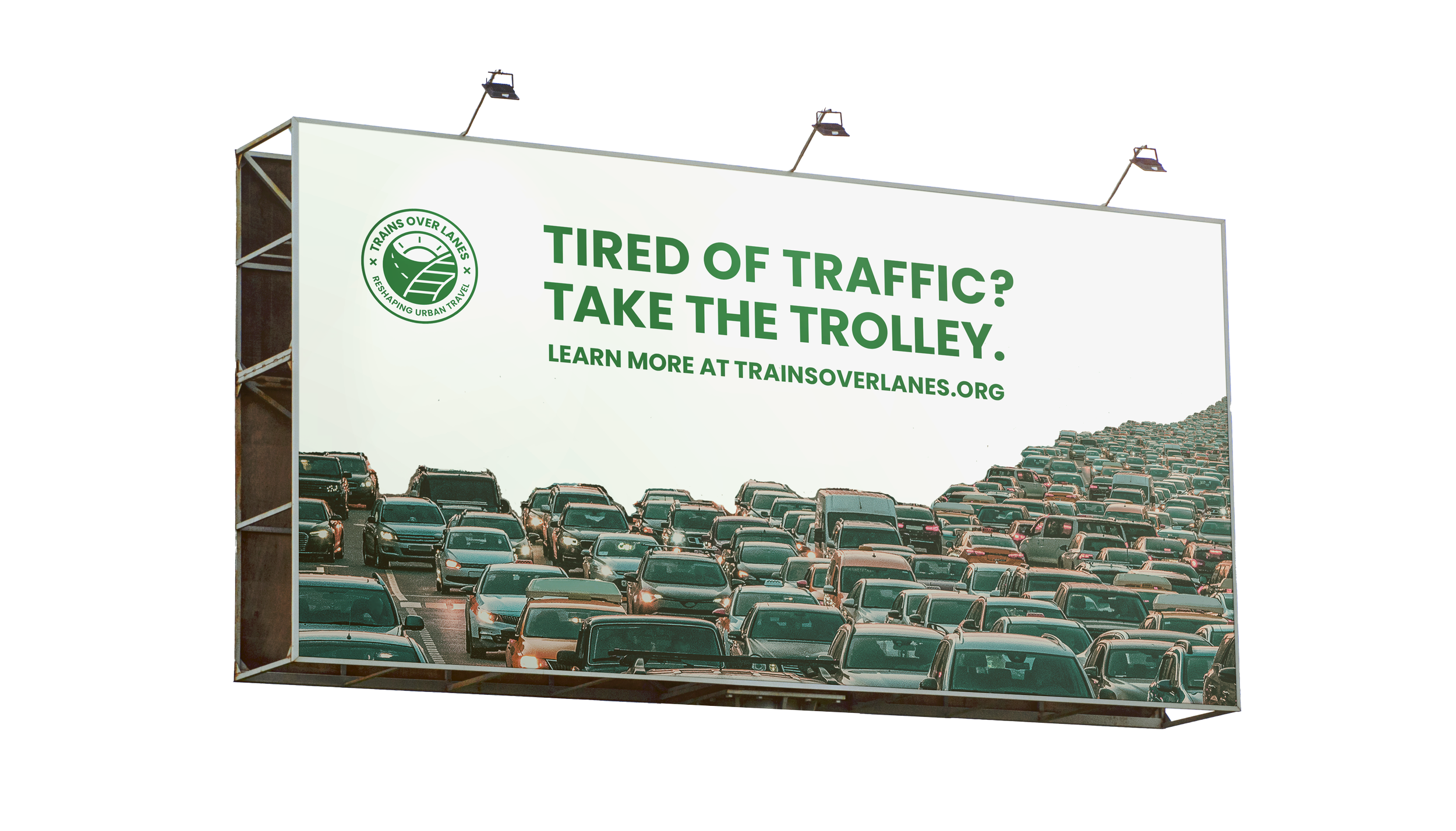
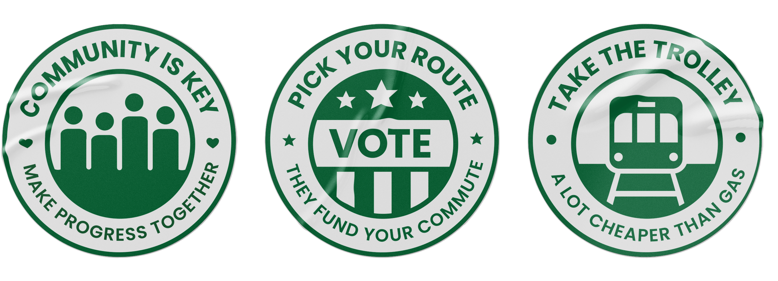
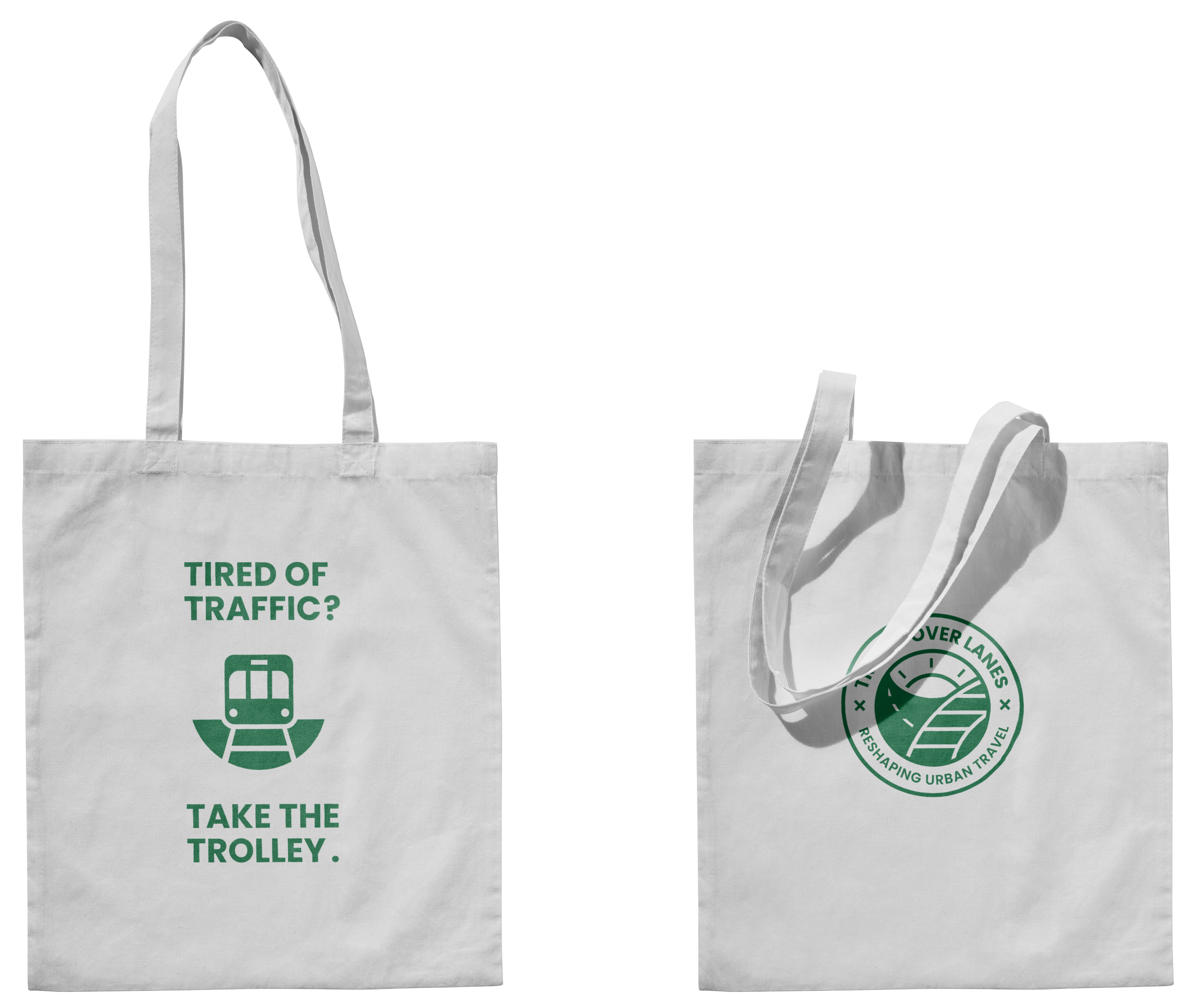
I designed several emblem logos with creative slogans that can later be used in any progressive campaign fighting for safer, cleaner streets & expanded public transit.
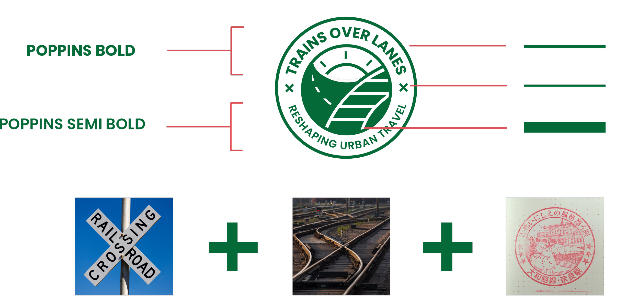
Mood + Logo Drafts
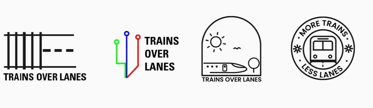
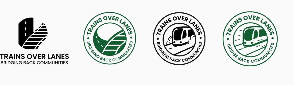
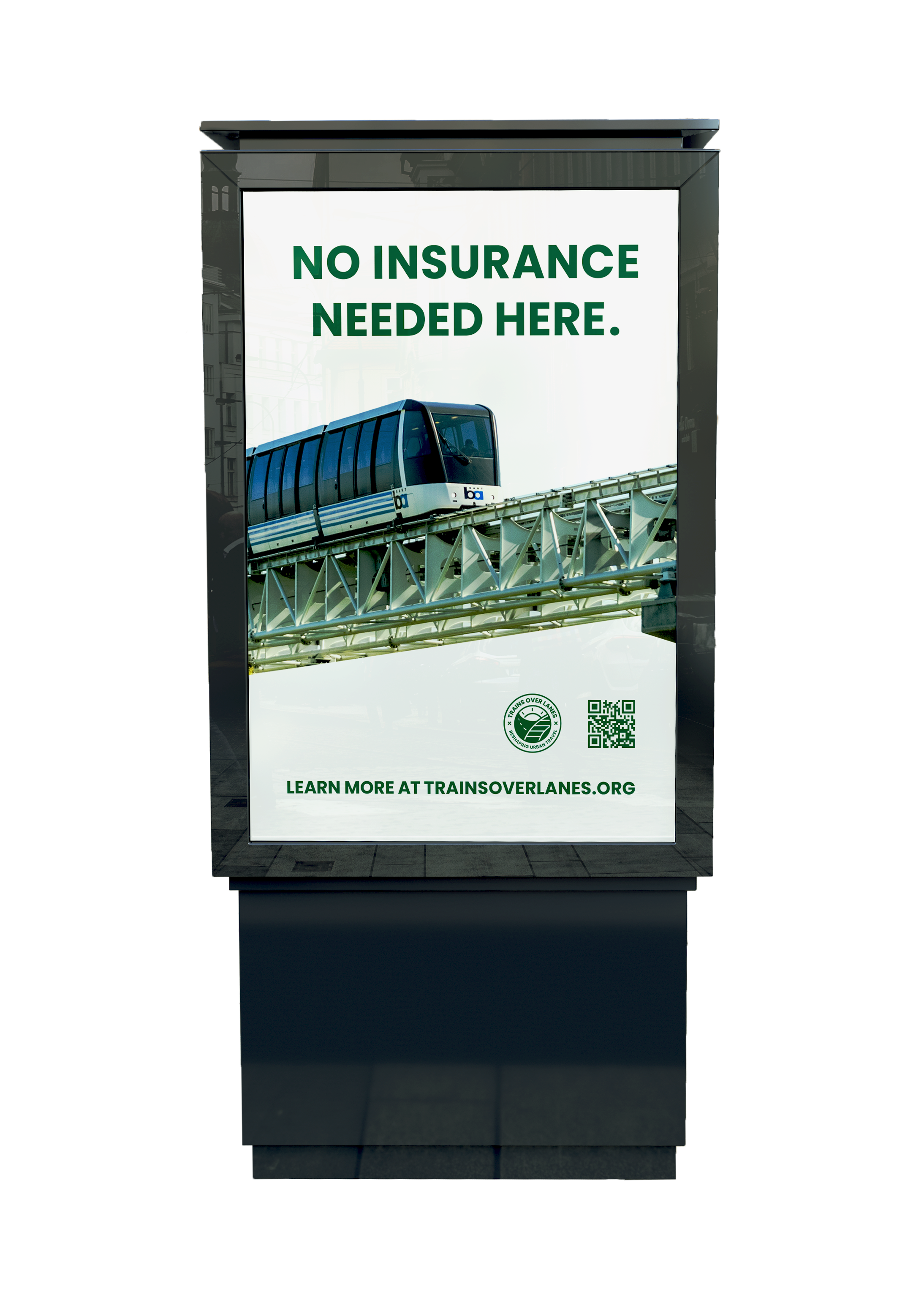
The logo is similar to an old school train stamp with the visuals of a switch rail where the railroad takes over the street representing choosing trains over lanes. The brand utilizes a solid green color to evoke a fresh, eco look. The stroke weights stay proportional throughout all media to make the brand uniform like the public transit system.
Brand Elements

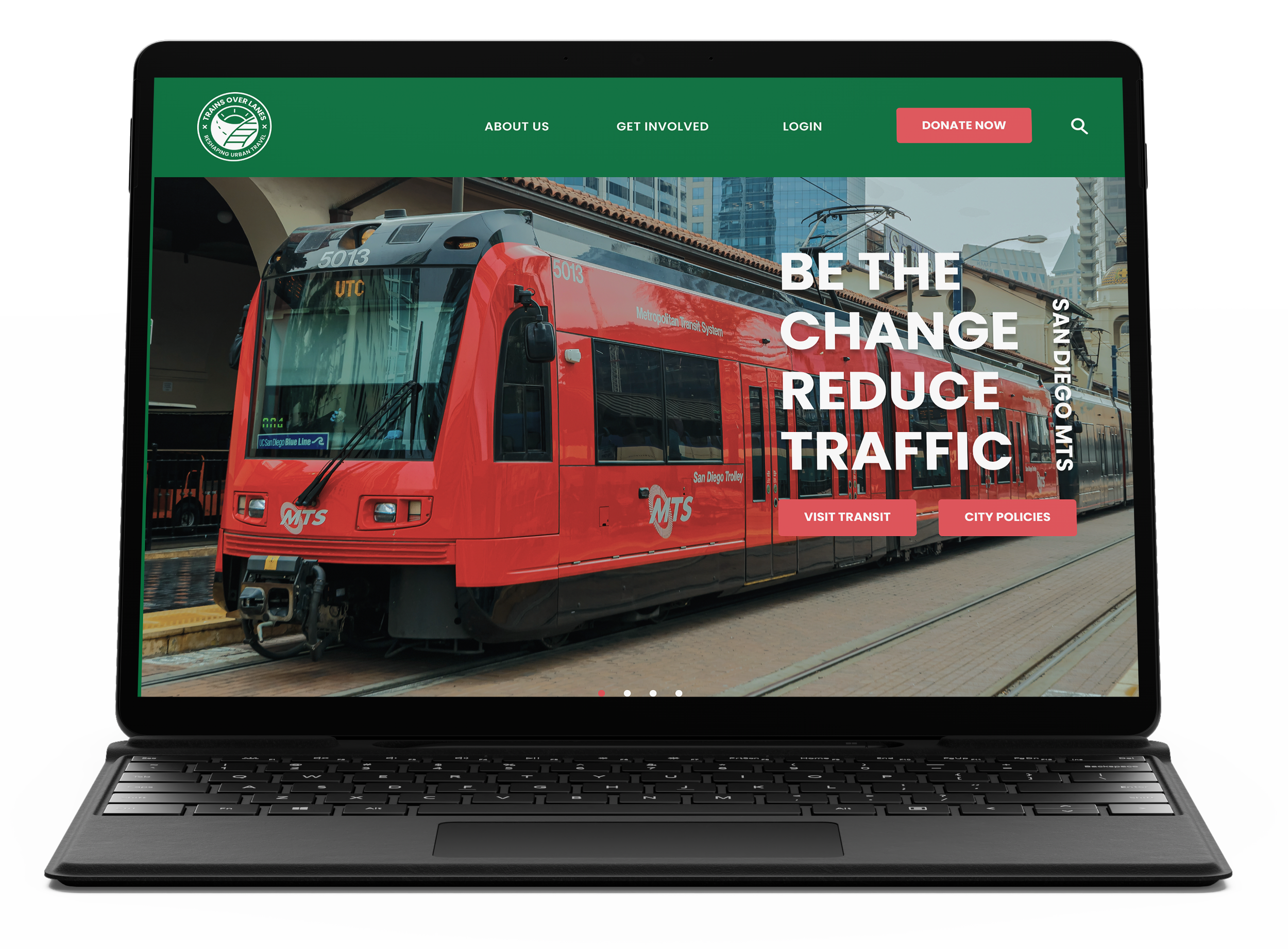
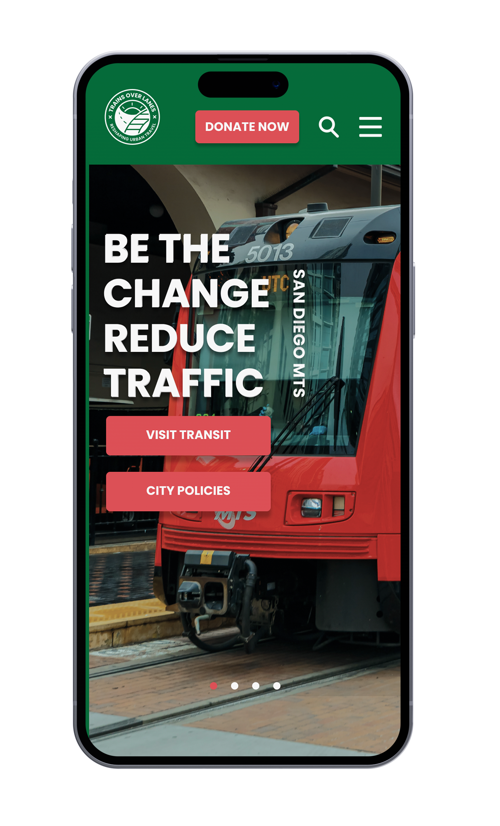
I wanted the look to be crisp & free flowing on a grid just like how I feel on the train. I used the map line pattern to act as a scroll tracker & tinted the photos to match the green branding.
I made the page with an objective flow, starting with a call to action, then followed with clear information & context for solutions.