Freelance, Rebrand | 2024
Rip Tie is a startup company that provides unique, easy to use hair ties that keep the hair in place with no knots or tangles. Although this product began with the idea of it being used for outdoorsy sports, it has become versatile with customers in almost any environment. Taking this in consideration, I created a unique brand that would appeal to a broader target audience while still giving a sporty & adventurous vibe.
Rip Tie Hair Ties
Client Meeting+
Design Process
Upbeat, active, mostly female of all ages from urban & suburban areas. They use RipTies to keep their hair tied snug for sports, outdoors, and everyday errands.
Audience
Factors I considered were visually disrupting the brand from other sportswear brands such as winki, vuori, and REI using a fun, relaxing and organic branding that doesn’t get too greenwashed or minimal.
Process
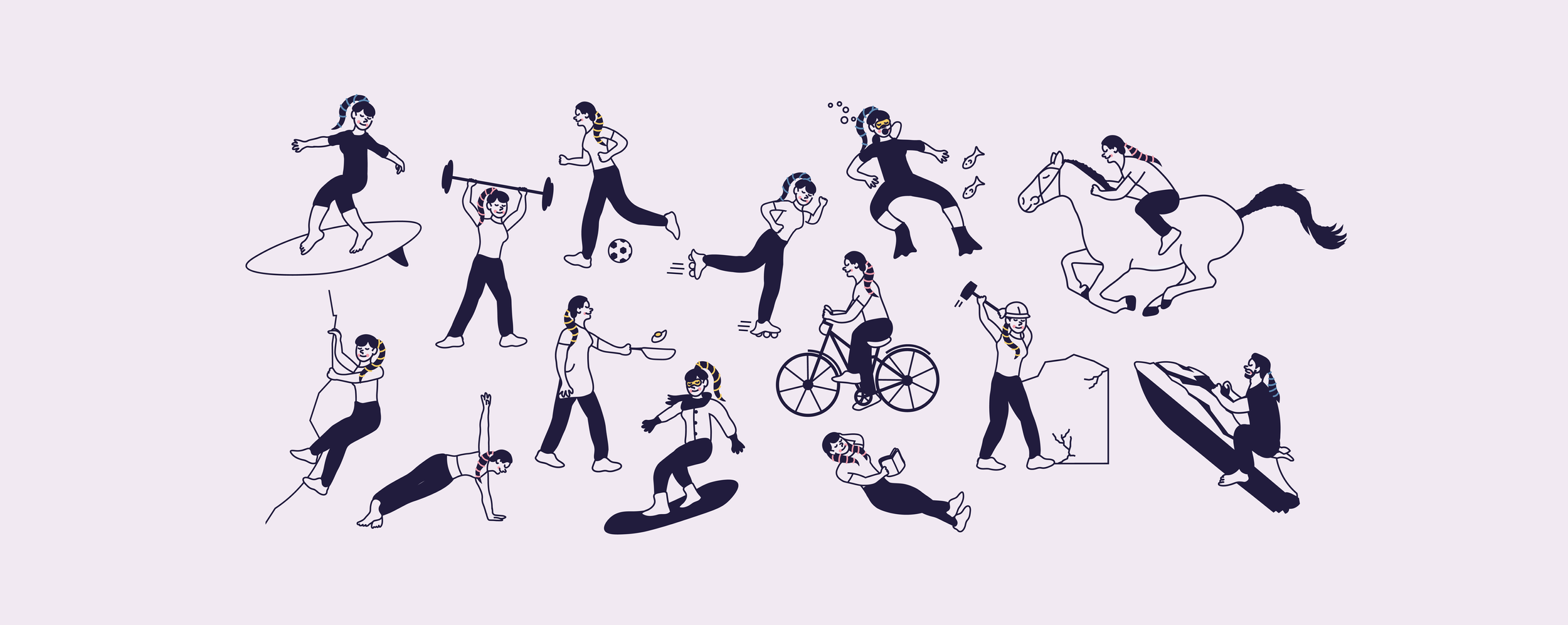
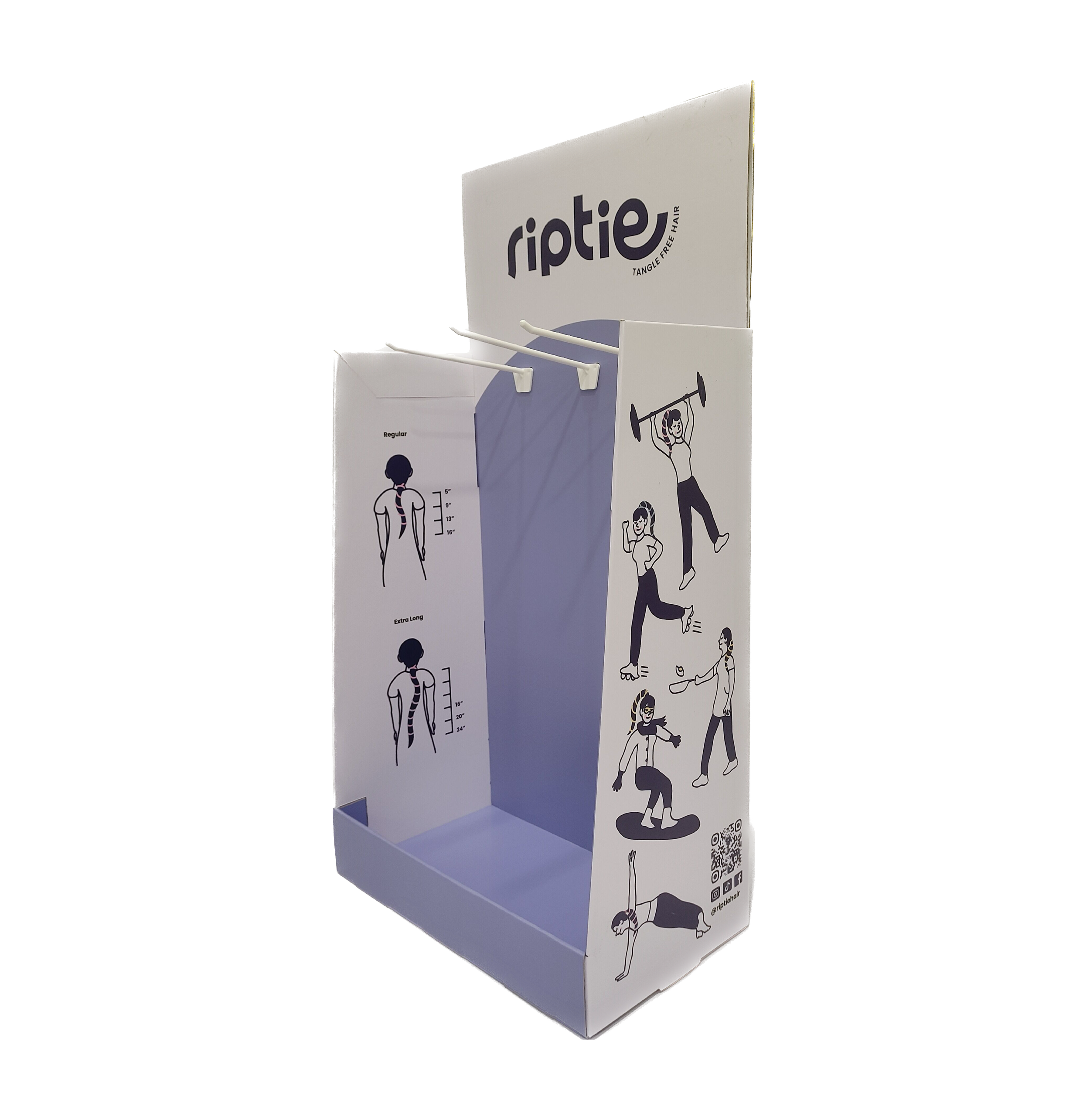
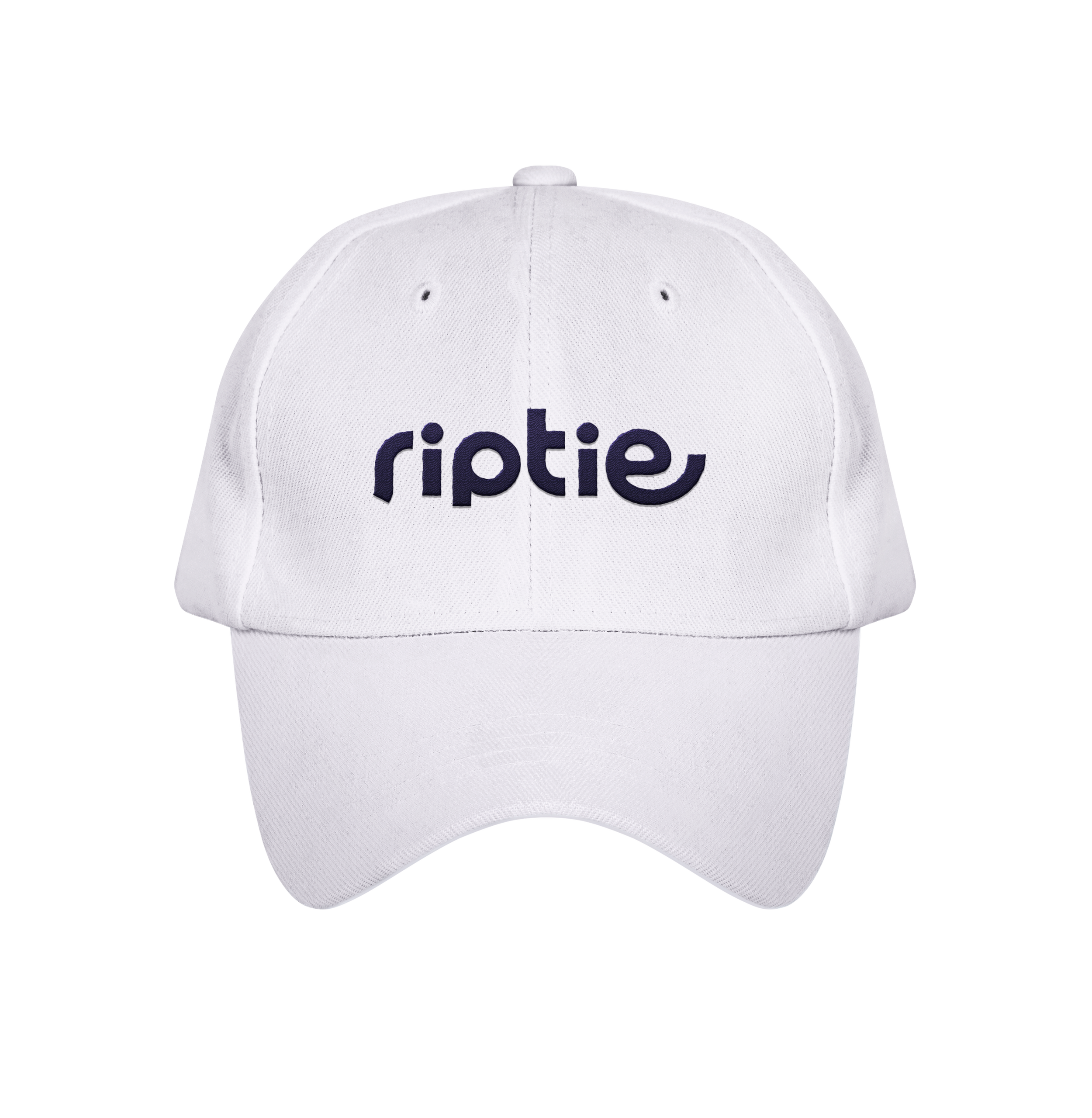
I crafted a bold, elongated type logo resembling the elasticity of RipTie. Along with the logo is a fun set of illustrated cool tone-colored characters performing a variety of sporty & casual activities while wearing the hair tie, adorably presenting the product’s versatility.
Brand Elements



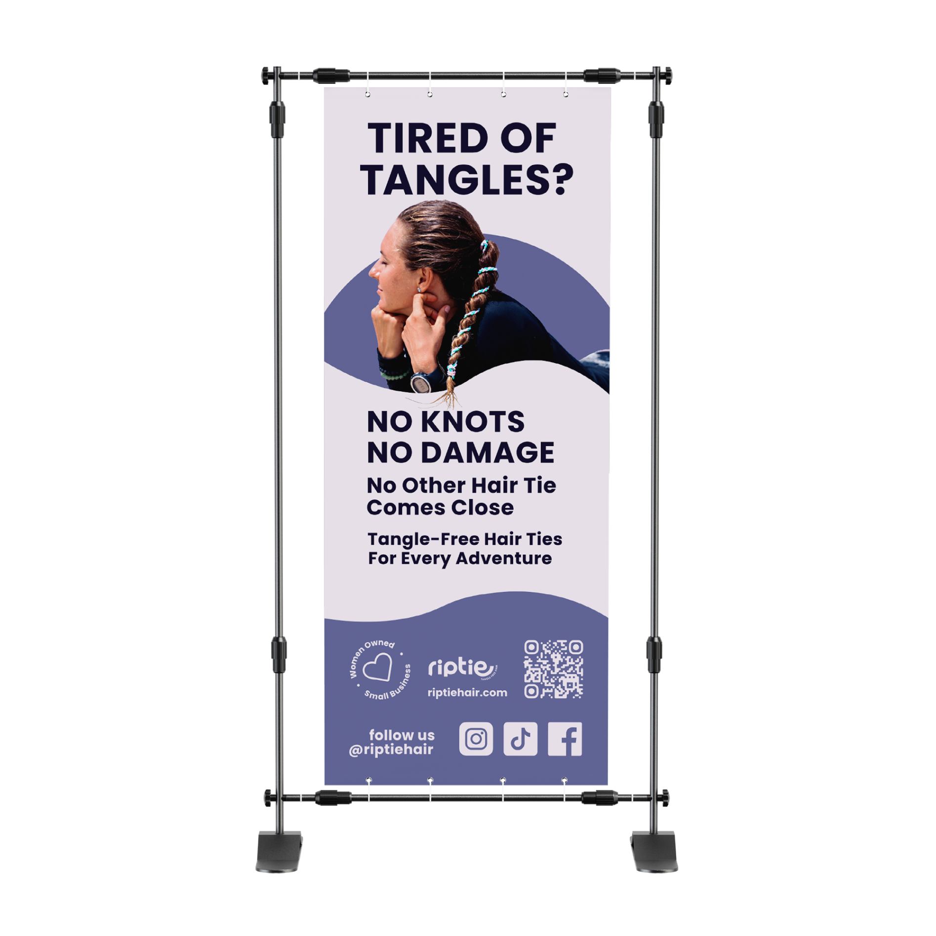
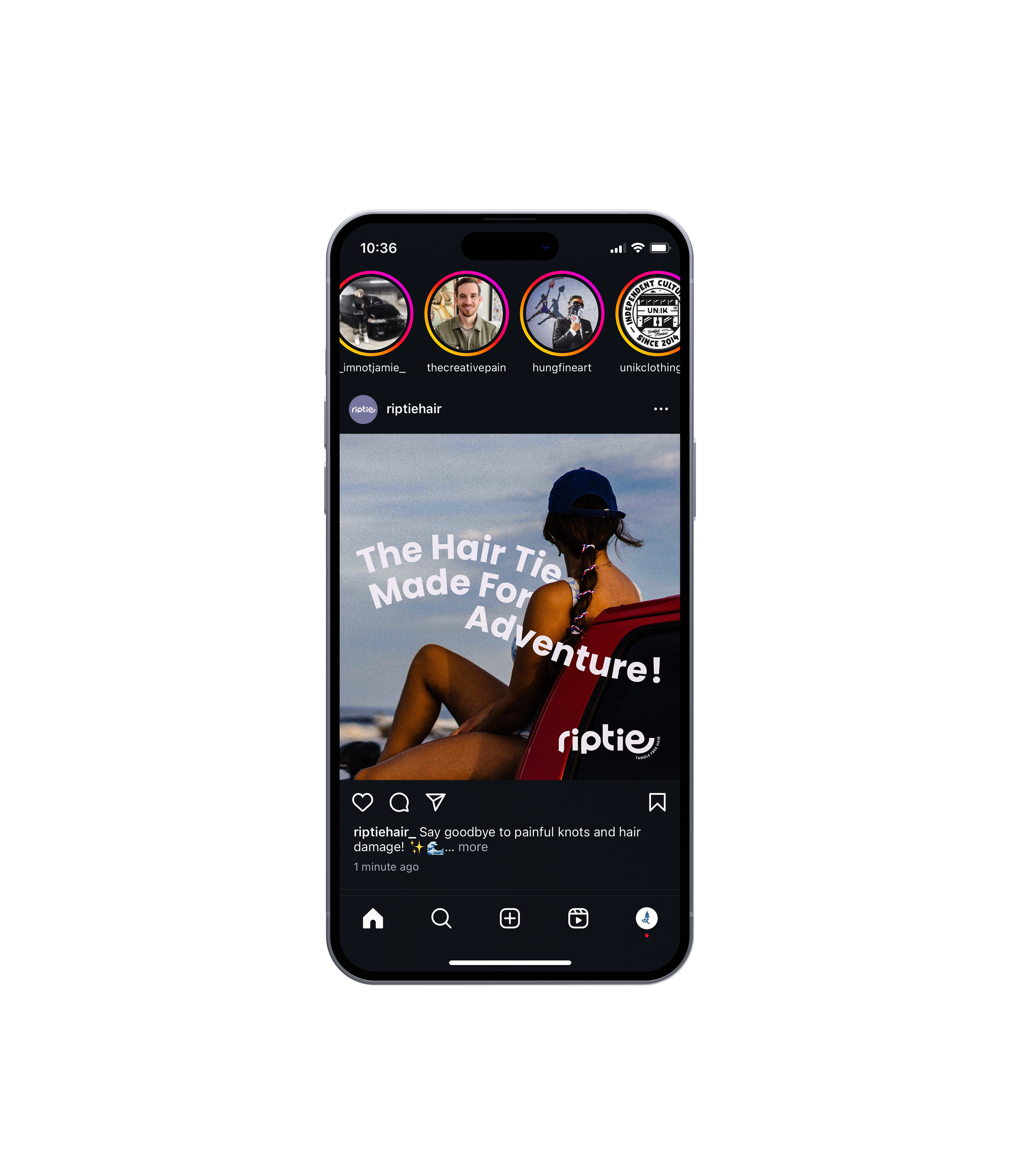

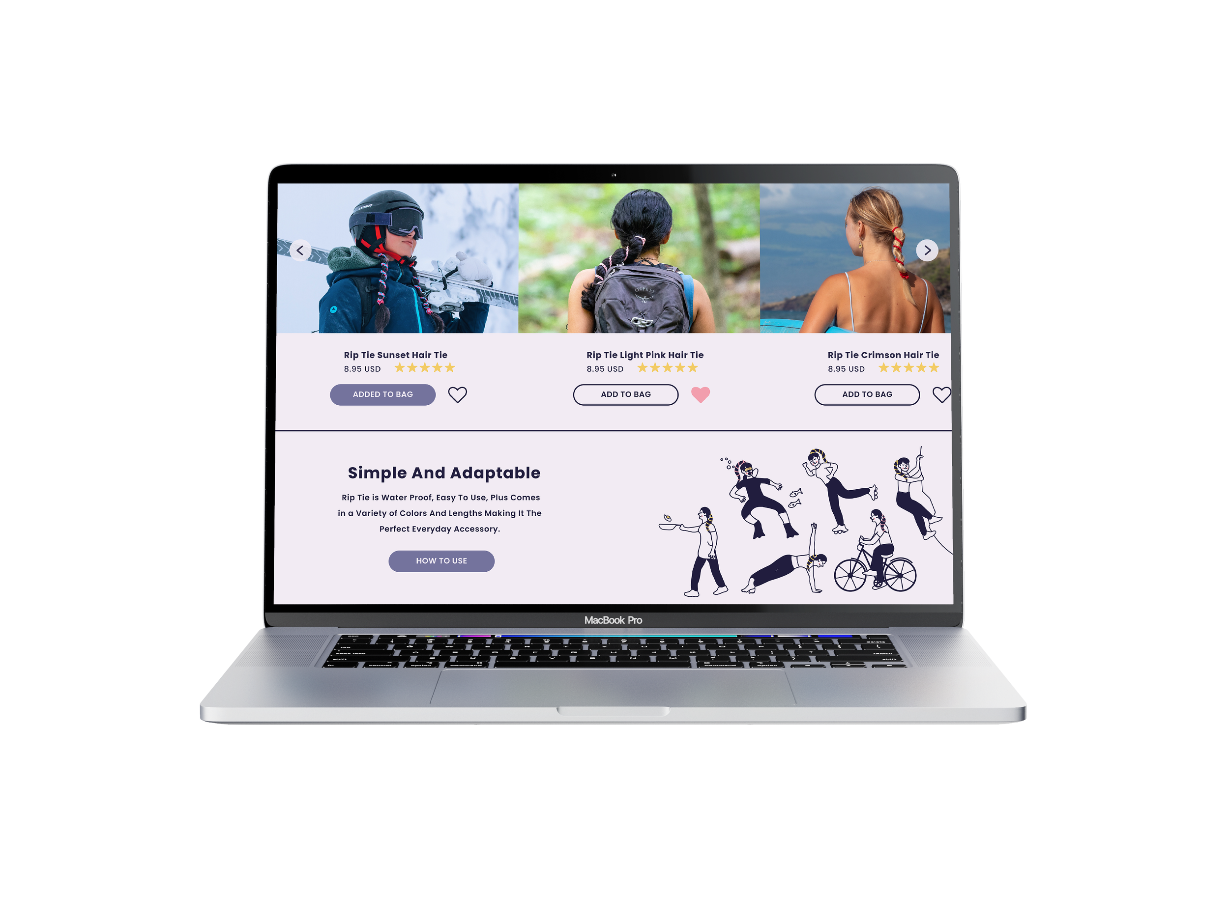
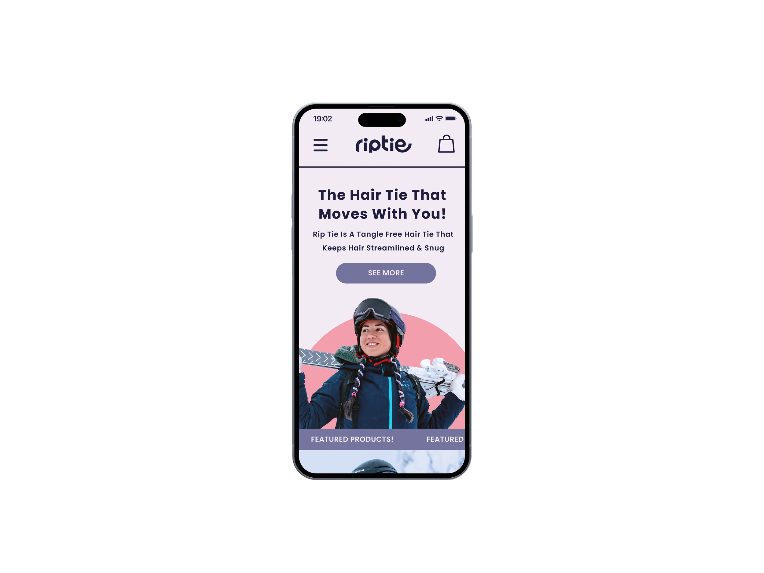
When designing the website, I prioritized the photography so viewers could see a clear use of the product in a variety of situations. Using photoshop I made sure the hair tie popped out from the subjects throughout all of the brand.
Web Design
Waiting for publication


