With California’s population growing, many issues are growing too, such as traffic in cities, costs to own a car, pollution, and accidents. Despite more lanes & electric vehicles these problems in our cities grow persistently.
Our mission is to advocate for increased usage & funding of public transit throughout California’s major cities. Adding more viable travel options is the key solution to reduce both street traffic and car accidents, leading to faster and safer commutes.
Trains Over Lanes
Branding | 2023

Moodboard + Logo Drafts
Trains Over Lanes targets Gen Zers & Millenials of all backgrounds who are done depending on cars to get around their cities due to problems that come with driving. When designing the branding I wanted it to be bold, concise, communal, clear, nostalgic and fresh.
The brand stands out amongst competitors like Strong Towns by being focused on a single solution, local public transit; rather than tackling all the solutions to human centric cities. I designed several logos to give a fresh, nostalgic & bright look of progress overtaking the problem.
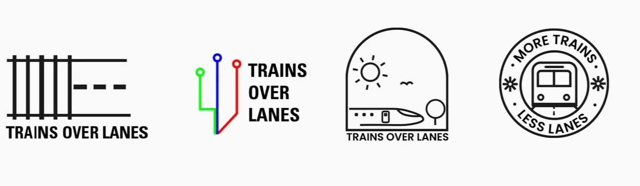
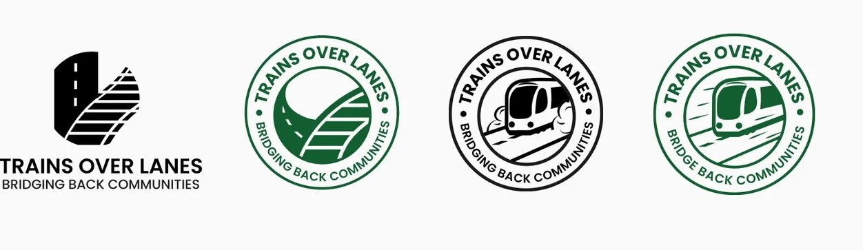
The logo is similar to an old school train stamp with the visuals of a switch rail where the railroad takes over the street representing choosing trains over lanes.
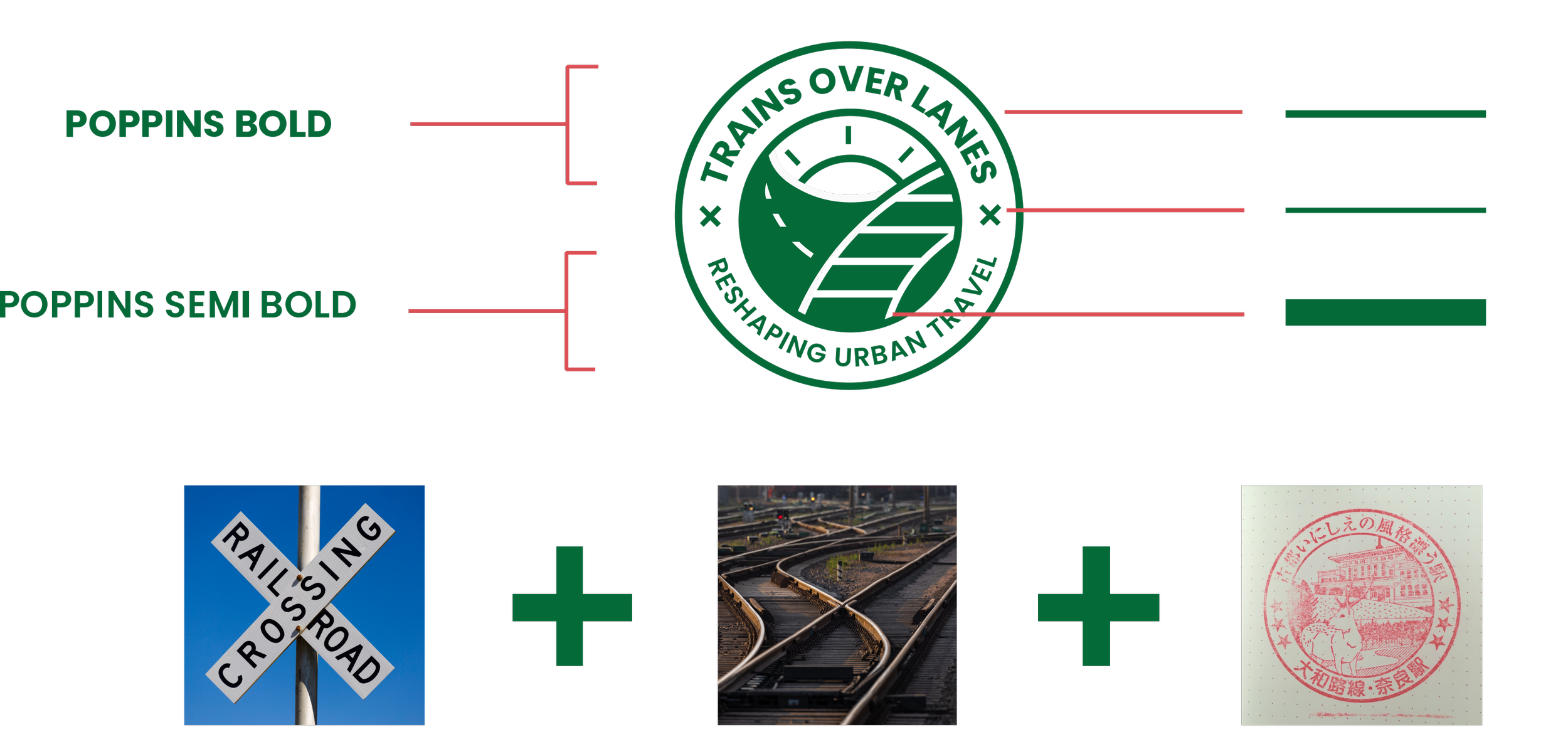
The brand utilizes a tinted, solid green color in both the photos & illustrations to feel modern, eco-positive, and fresh. The three stroke weights stay proportional throughout tall media, with the middle & thin strokes being very close Poppin’s weight.
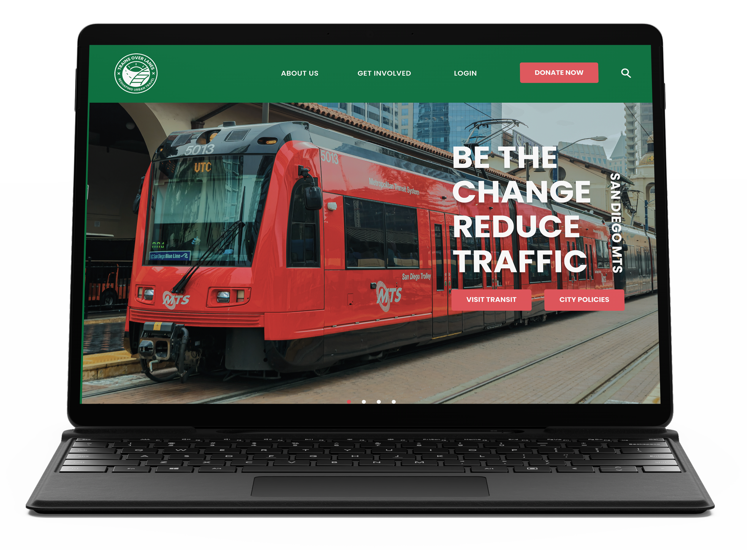
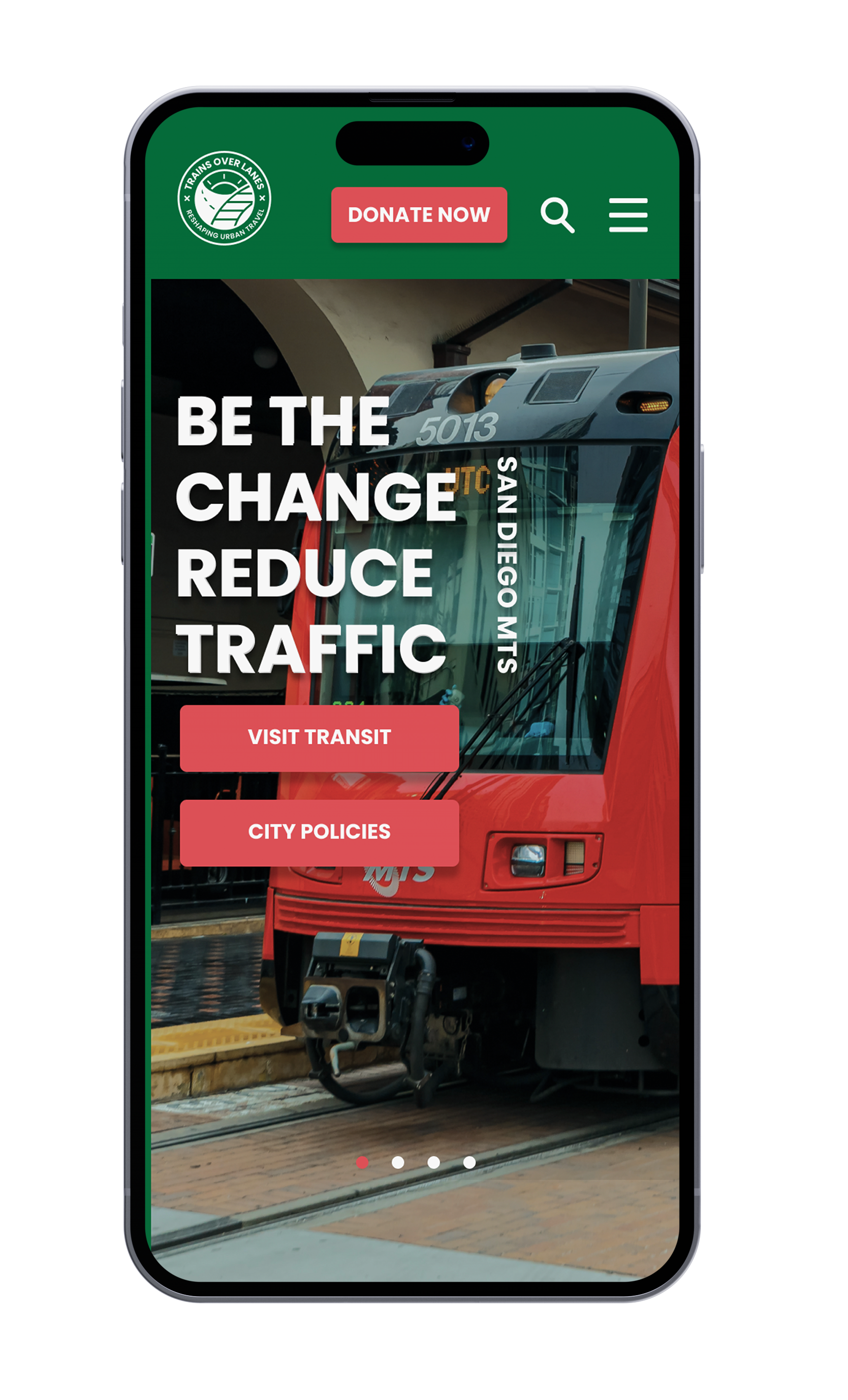
Brand Elements


Apparel

I wanted the look to be crisp & free flowing on a grid just like how I feel on the train. I used the map line pattern to act as a scroll tracker & tinted the photos to match the green branding.
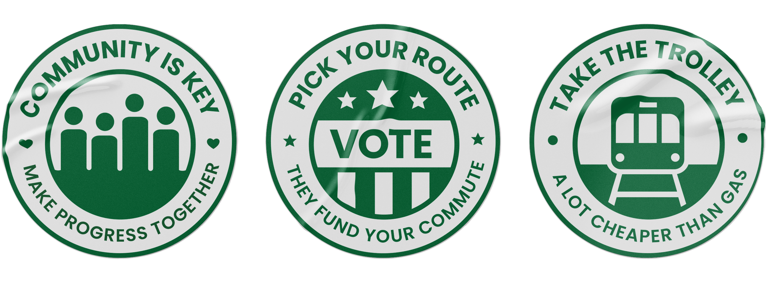
I made the page with an objective flow. Starting with a call to action, then intro text followed by related videos & statistics and ending with specified call to actions defined by the icons.