

Cibo Italiano is a small, local restaurant with a variety of services. The store’s interior is welcoming, having mixed feel & decor of an Italian NYC deli & cozy home. Due to its casual vibe, quality meals and market, Cibo Italiano is able to cater to people looking for niche ingredients, a fast & convenient bite to eat or a full-on authentic dining experience.
Case Study, Rebrand | 2024
Cibo Italiano

Old Logo Analysis
1 | Organic, soft & colorful art style
2 | Bodoni is very Italian, but underused
3 | Is appliable on storefront signage
Strengths
Issues
1 | Both typefaces do not work together
2 | Hard to brand & adapt logo to one color
3 | Tomatoes are used all around the world
Moodboard + Logo Drafts


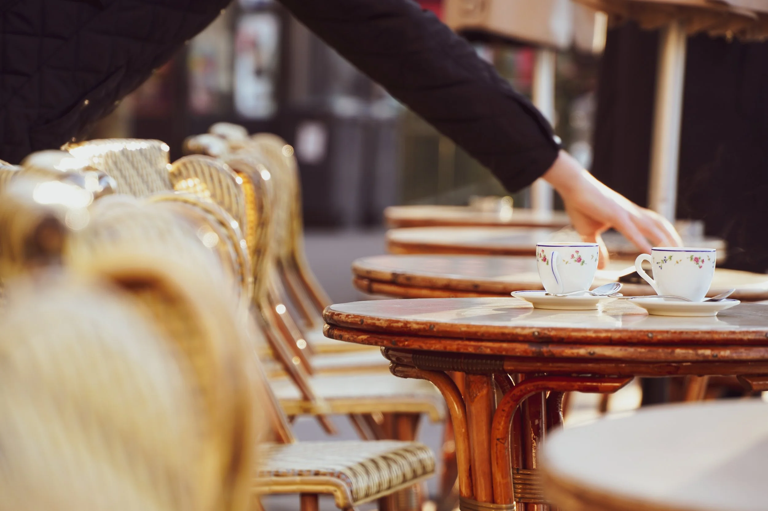

The mood I applied on the brand is focused on maintaining a look that is both sophisticated & authentic but also obtainable & vibrant. The brand meets the middle showing a smart casual look, basically meaning high quality food without wearing a button up.
Brand Attributes & Process
Authentic | Nostalgic | Cozy | Quality | Diverse | Rustic
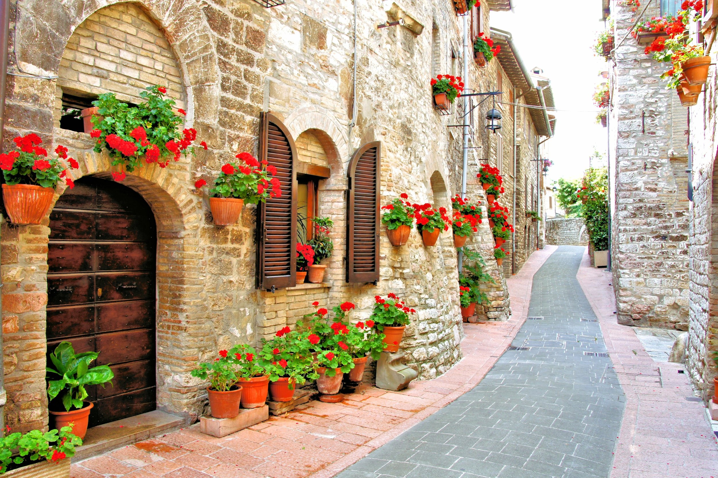
Referencing what makes the Italian dining experience authentic & comforting led to drawing inspiration from Italy’s natural hues, artsy typefaces, home cooks, architecture, and love for olives.
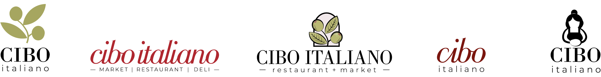
Rebrand Elements

Olive branches and arches are more representative of historical Italian culture as compared to tomatoes. The olives match the same shape as Bodoni’s O to tie in the type + visuals better together. The olive-green and its expanded color family give a natural and cozy tone throughout the brand.


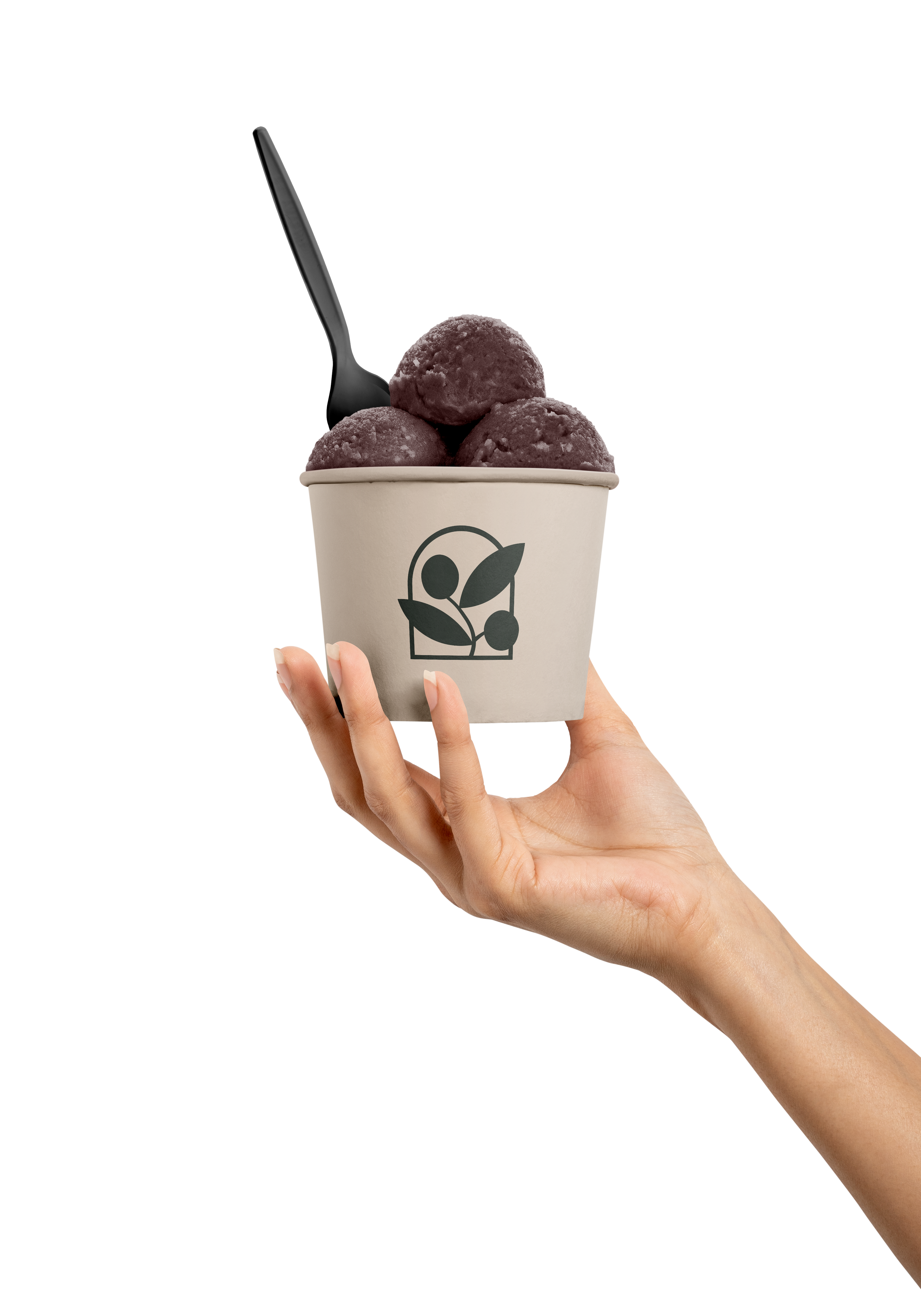
Packaging


Store Collateral


I wanted to expand on the services & information that the business never had online, leading to a dedicated e-shop page for the deli & market. I also added in text emphasizing the restaurants transparency & quality, something that 90% of the food industry could never boast about.
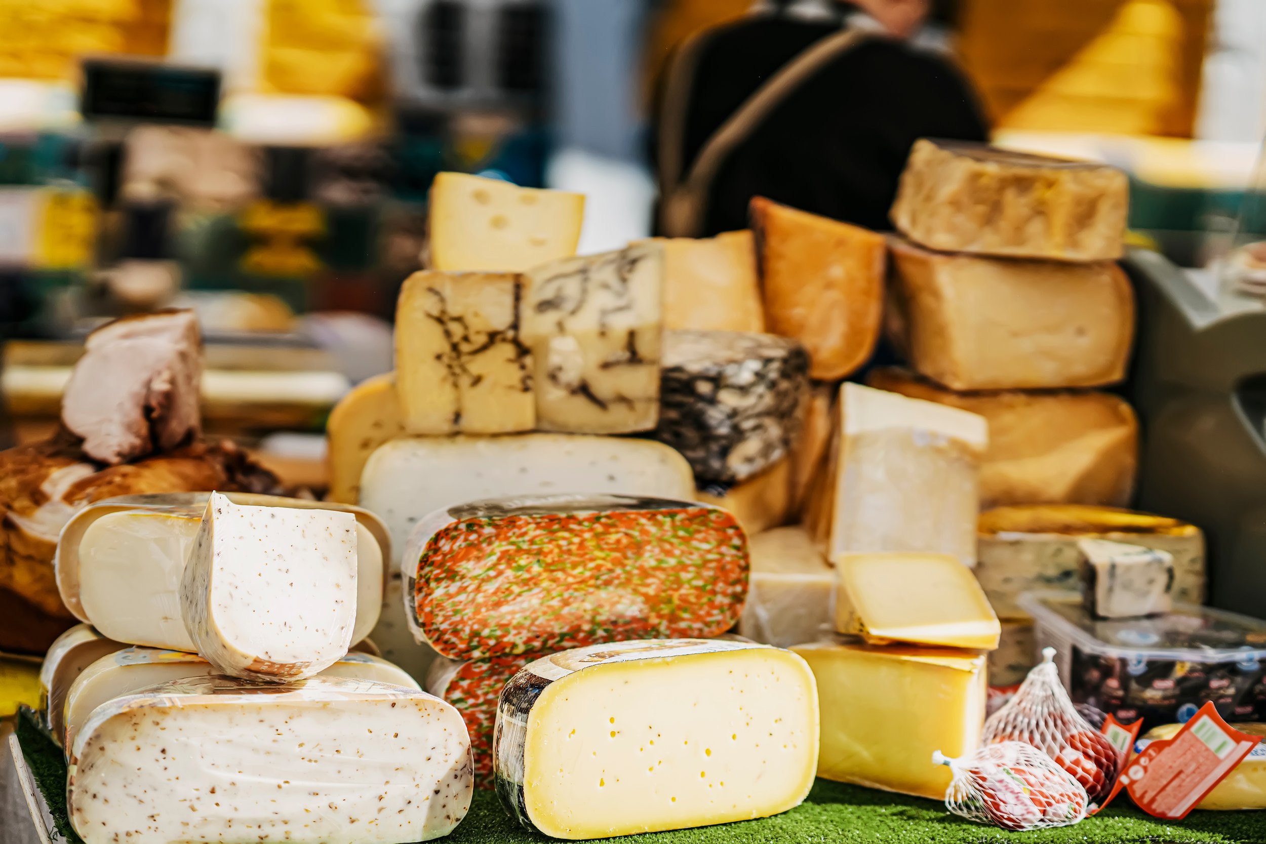
I chose exquisite close-up images with a green overlay to match with the overall branding and give emphasis to the high-quality food & services provided at the restaurant.